PEPSI
Thirsty for more.
A self-directed spec commercial: an anime club spot for Pepsi's Thirsty For More, taken from a hand-drawn nine-panel storyboard to a finished fifteen-second film. No brand to build here, this one is pure art direction and AI filmmaking, the same pipeline pointed at a completely different visual language.
Overview
A spec film, built solo with AI
Pepsi, Thirsty For More is a self-directed spec commercial, an anime club spot for an existing brand rather than a brand I built from scratch. It's a deliberate departure from the photoreal work: no naming, no packaging, no product to design. Just art direction and filmmaking, taking a hand-drawn storyboard all the way to a finished fifteen-second cut.
The point was range. Same pipeline, pointed at a completely different visual language, to prove it holds outside the polished-product world.
The idea
Thirsty For More
A neon-soaked anime club, cut to a bass drop. Energy, movement, refresh, the can as the hero of a world that feels like a music video rather than a soda ad.
The whole thing lives in a bold 2D cel-shade style, a hard left turn from the realism, chosen precisely because it's the harder thing to keep consistent across a moving shot.
“Thirsty for more.”
Pepsi
The film
Fifteen seconds, eight beats
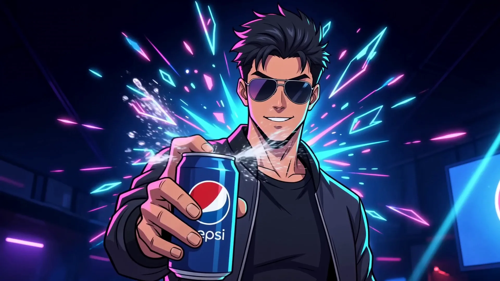
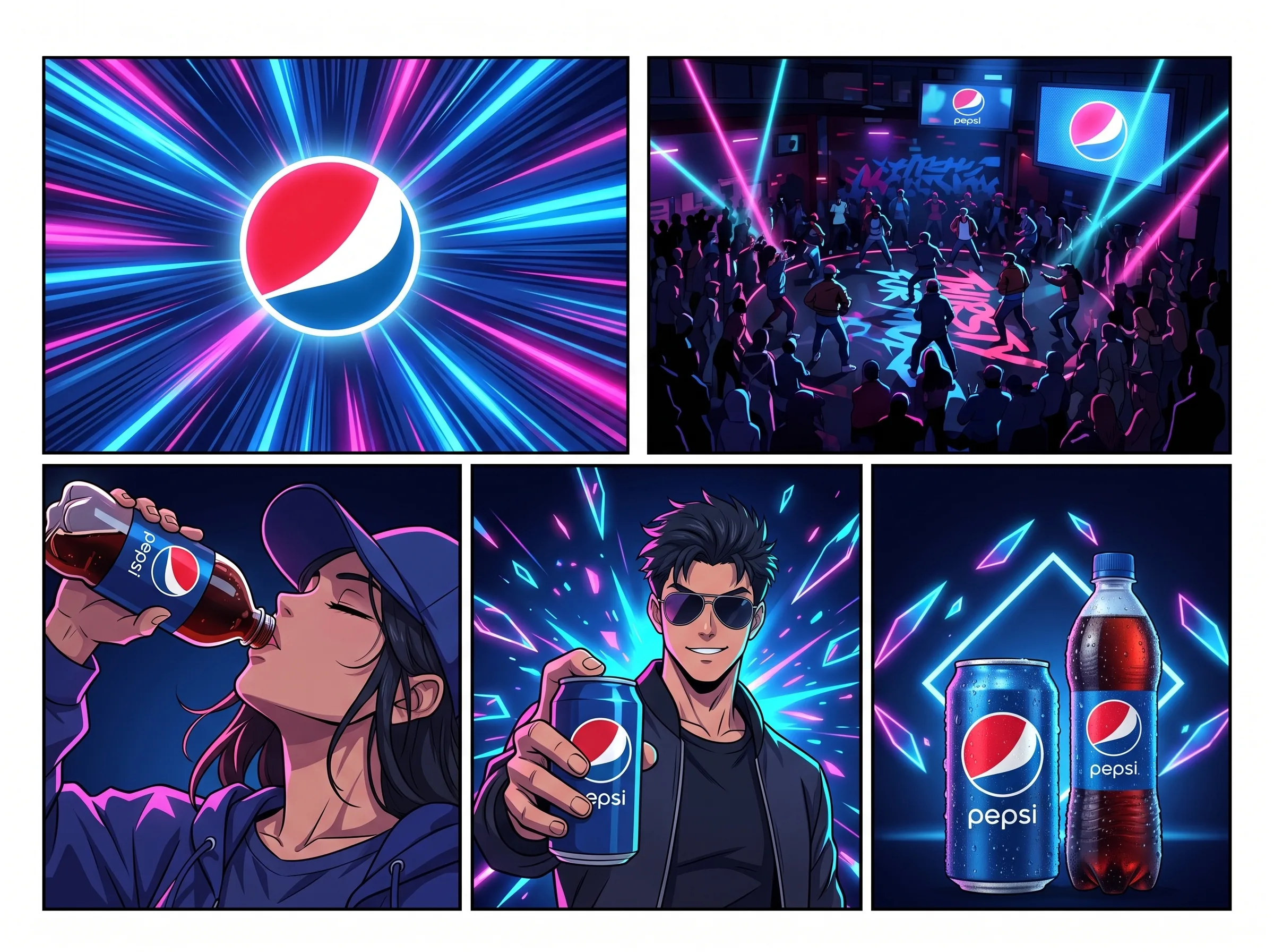
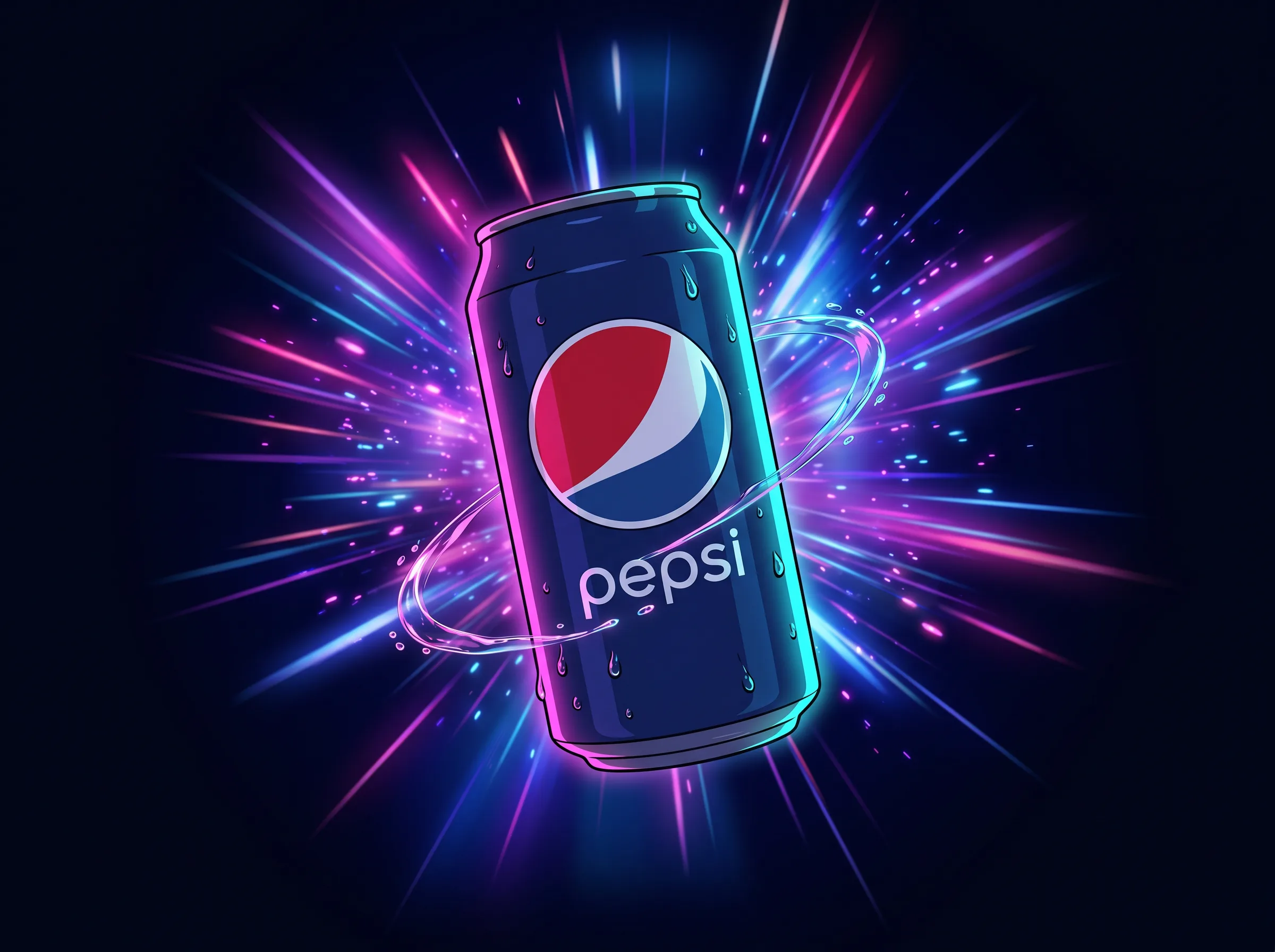
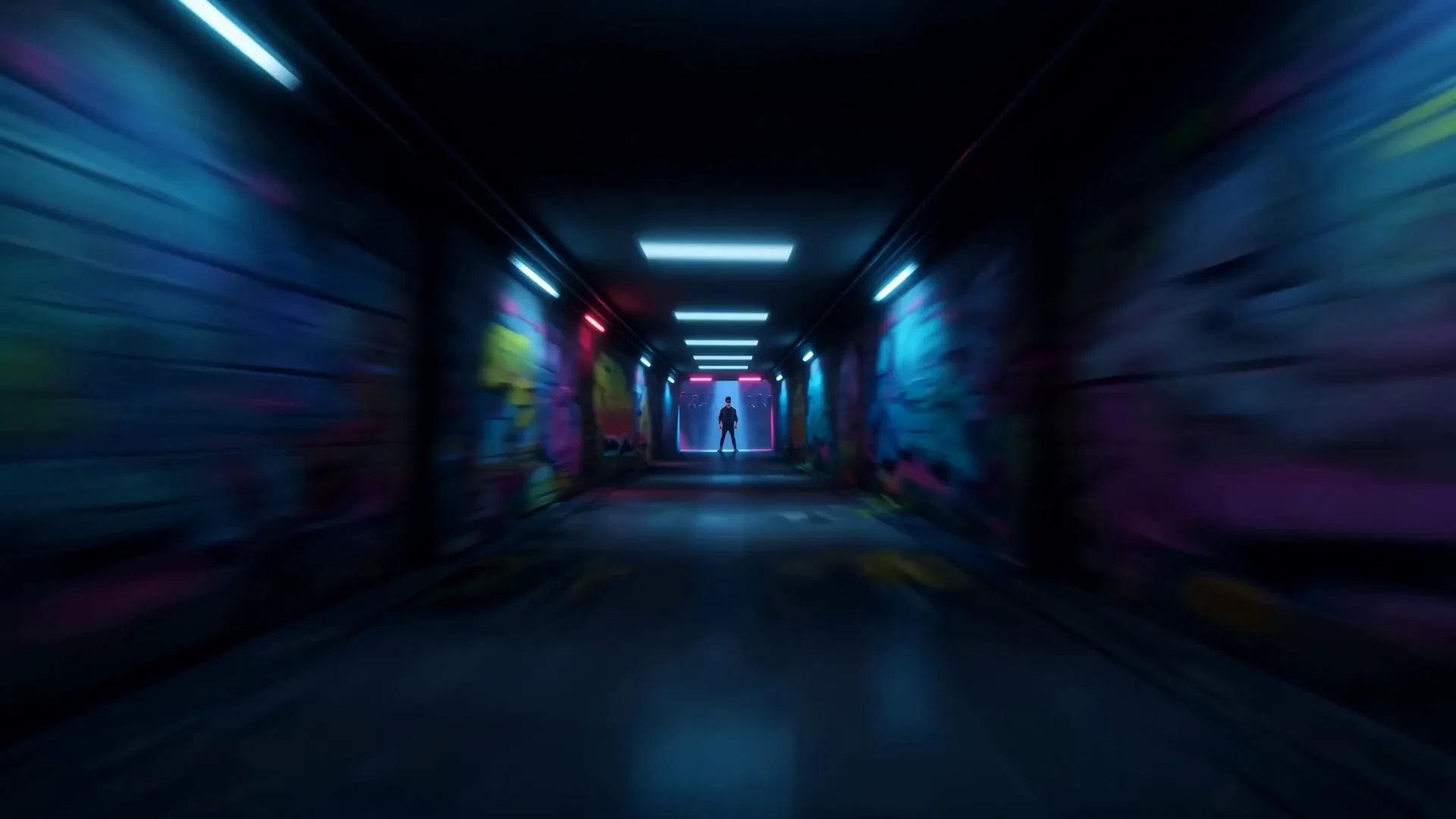
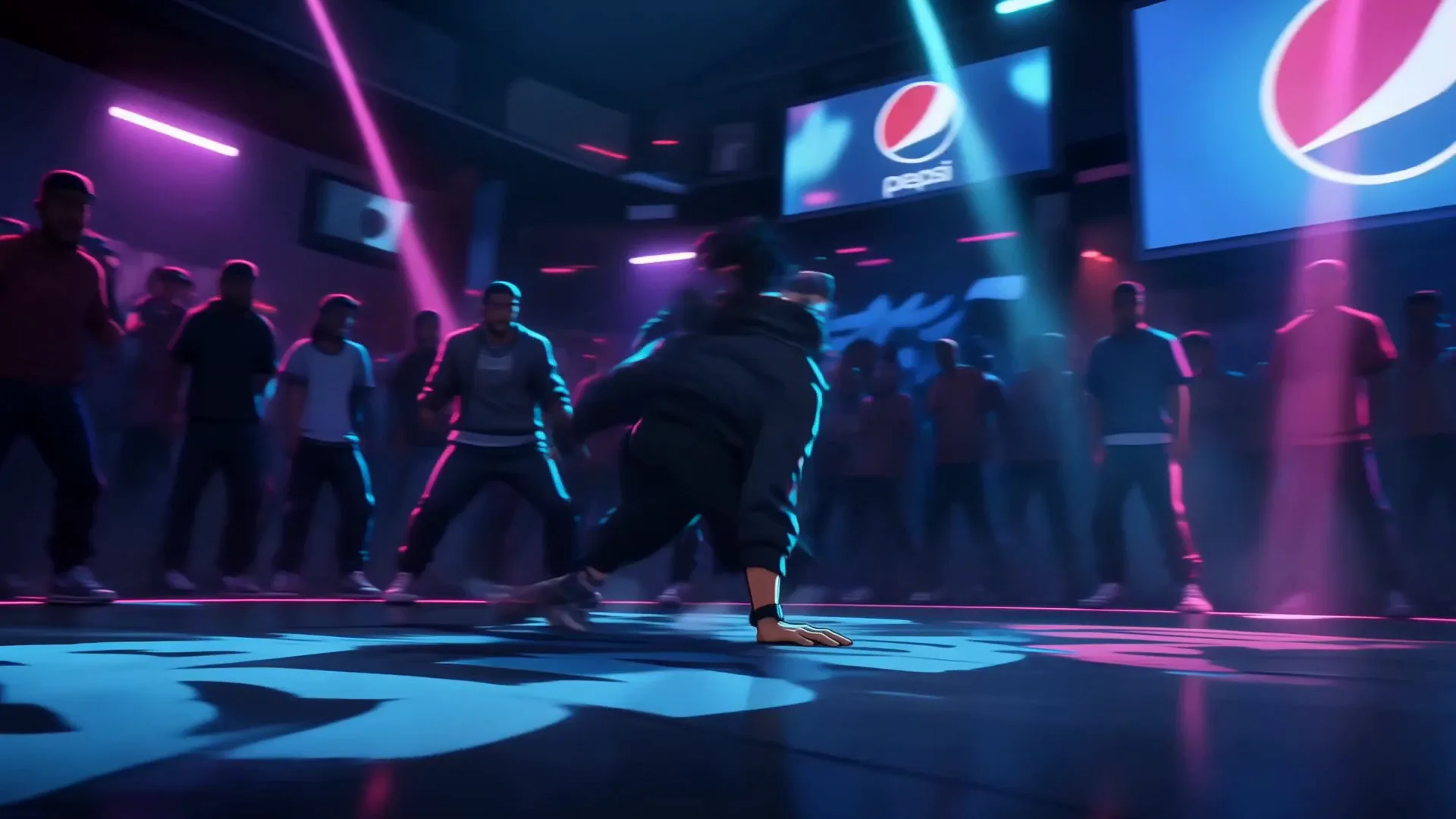
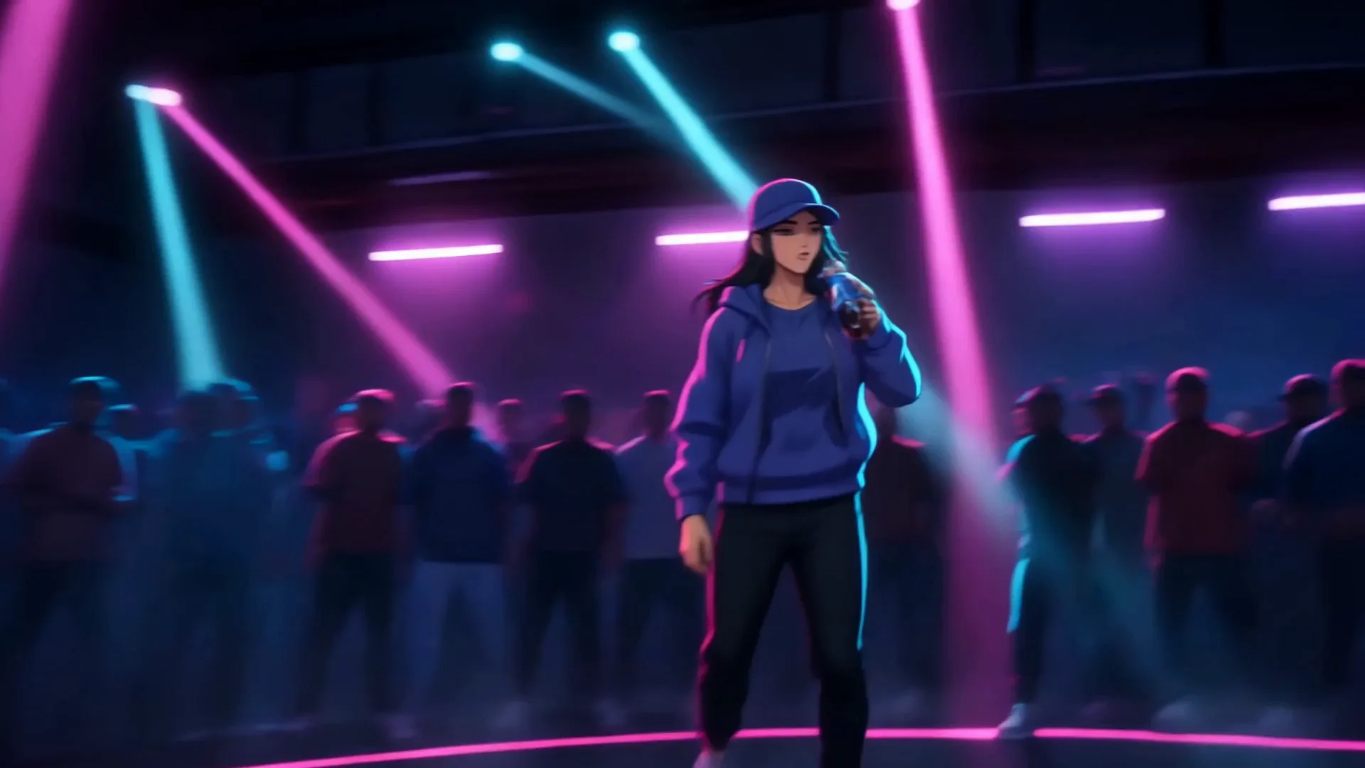
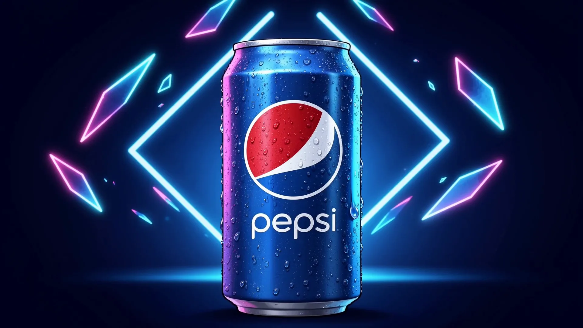
The globe logo rockets through a neon light tunnel and bursts into the club; a crash-zoom carries through the crowd to the hero; he cracks the can with the spray catching the light; hard cut to the cap girl drinking, head back; a b-boy freezes mid-air as the dance-off trades moves; the hero turns the can straight to the lens with a grin; snap to the end-card.
Painterly cinematic wides alternate with crisp cel close-ups, the hybrid the brief was after. Play it with sound.
Art direction
The look
One style lock, carried into every frame: bold clean lineart, cel shading with hard neon rim light, deep navy-black club darkness cut by electric pink, cyan and Pepsi-blue beams, and high-contrast speed lines on every move.
Reference-driven, so the look never drifts from shot to shot.
Art direction
Neon club
The whole film lives in four or five values, navy-black darkness, Pepsi blue, and two hits of electric neon. Restraint in the palette is what lets the speed lines and the rim light read as energy instead of noise.
Club Black
#0A0E1A
Pepsi Blue
#0A4EA2
Cobalt
#2A57D6
Cyan
#21E6FF
Electric Pink
#FF2E97
From storyboard
Nine panels, hand-drawn
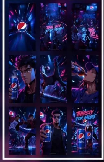
It started as a nine-panel anime storyboard: the logo through a tunnel, the title over the crowd, the hero with the can, the b-boy freeze, the cap girl drinking, the dance-off, the can to camera, the end-card.
That sheet was the style anchor and the shot list in one, the single thing every later asset was measured against.
Reference pipeline
How it stayed one film
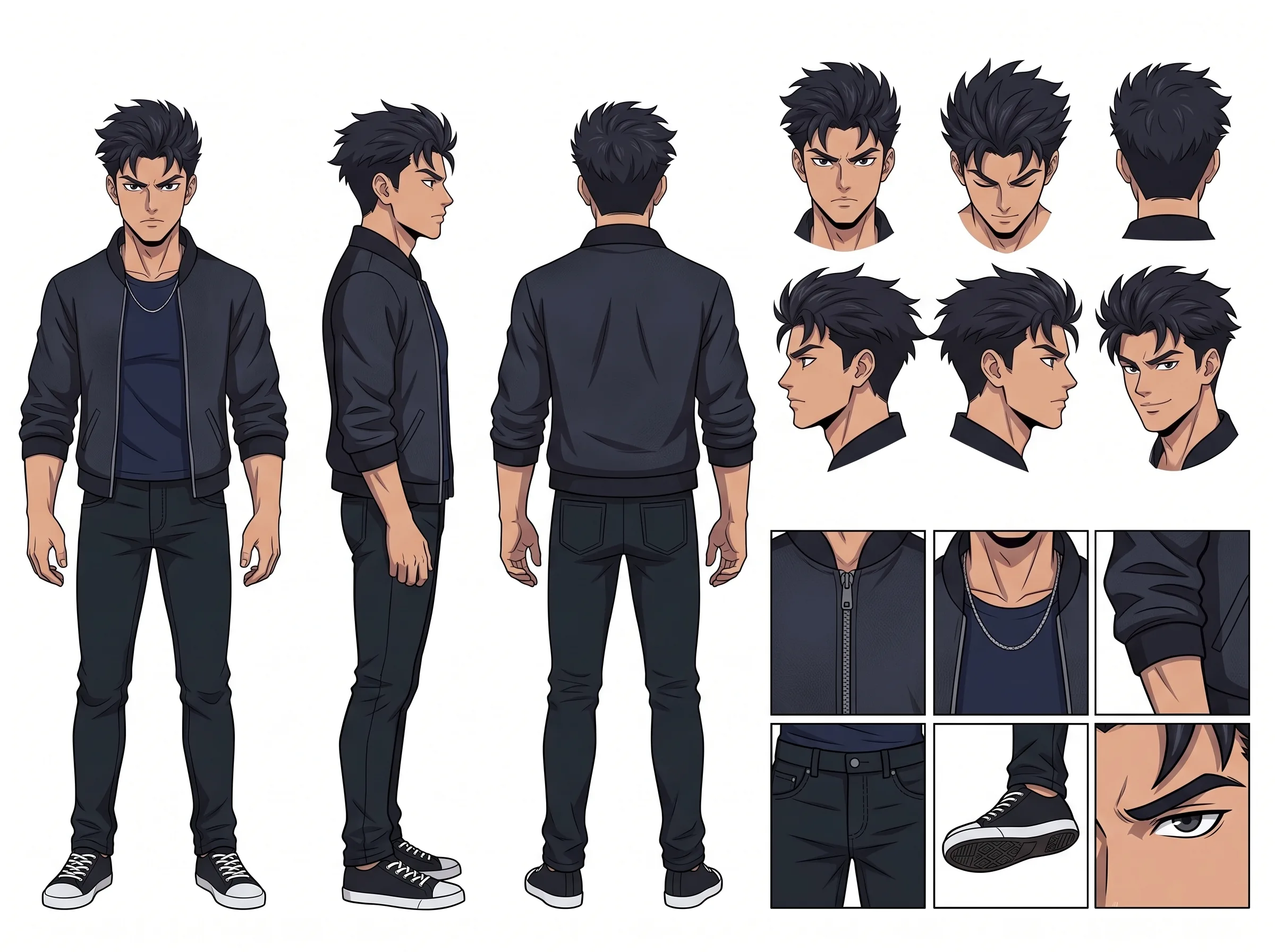
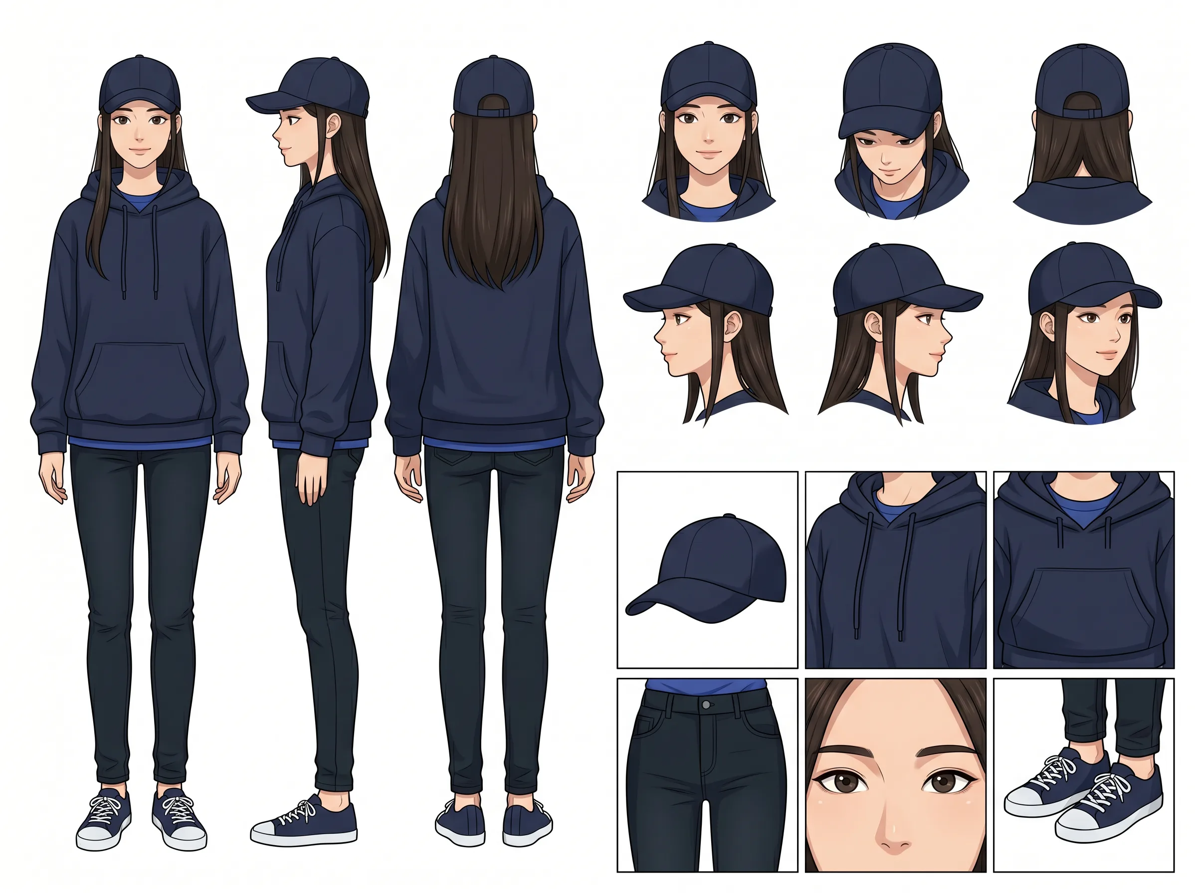
Everything ran reference-first. A hero character sheet and a dancer-girl sheet locked identity across every beat; a twelve-view can turnaround kept the product on-model; then a single five-beat reference board, can, bottle, both characters, the club and the style in one frame, drove the video generation.
The branding travels through the references, never the prompts. In text the product is only ever "a navy-blue cola can with a red-white-and-blue sphere emblem", which keeps the generator's IP filter happy while the real brand stays exact in the image.
Key frames
The moments it turns on
The best beats, pulled from the cut as stills.
Tools & process
Storyboard to screen
Built through Higgsfield. GPT Image 2 and Nano Banana Pro for the character sheets, the can turnaround and the reference board, all style-locked to the storyboard so identity and branding held. Seedance 2.0 for the video, which takes one reference image per call, so the five-beat board did the heavy lifting.
Fast, cheap probes first to validate the beats and catch drift, an early cut let a character's outfit shapeshift between shots, fixed by locking the wardrobe in the prompt, then a standard-quality master once the read was clean.
What's next
The remaining mile
This is the picture-locked master. The remaining polish is post: the THIRSTY FOR MORE title and end-card lockup as graphic overlays, and a licensed club track under the sound design. The world and the cut are done; the finish is the last mile, same as the rest of the studio.
“Pepsi, Thirsty For More. A spec film, built solo with AI.”